
CIBI Solid Waste Resources
Examples Figures/Graphs
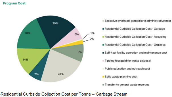
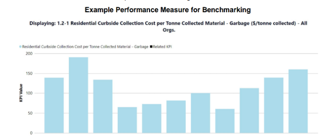
Once the data collection phase is complete, all community data is compiled and presented in figures/graphs to allow for an “apples-to-apples” comparison. Three examples of figures generated as part of the Solid Waste Service of CIBI are shown below.
- A pie chart is generated for each community to show a breakdown of the solid waste management system costs. (figure below).
- Residential Curbside Collection Cost per Tonne – Garbage Stream (figure below).
- Waste flow diagrams are generated to represent each community’s unique solid waste management system. (figure below).

CIBI Solid Waste Presentations
Each year the AECOM team facilitates technical webinars and townhall presentations that are driven by the communities relevant to the goals, areas of interest, and current barriers the communities may face.
Public Report